MNAA Use Case
The Challenge
The Museu Nacional de Arte Antiga (MNAA) is one of Portugal’s most significant cultural institutions.
However, its digital presence no longer reflected the museum’s relevance, scale, or public mission.
The challenge was not simply to redesign an outdated website, but to rethink how different audiences access culture, information, and services through digital touchpoints.
The existing platform presented significant usability and accessibility barriers, particularly for mobile users, tourists planning visits, educators organizing group activities, and students accessing academic resources.
The core objective of this project was therefore to transform a non-responsive, fragmented experience into a modern, accessible, and user‑centred platform, capable of supporting practical needs while reinforcing the museum’s role as a public, educational, and cultural institution.
The Problem (The "Why")
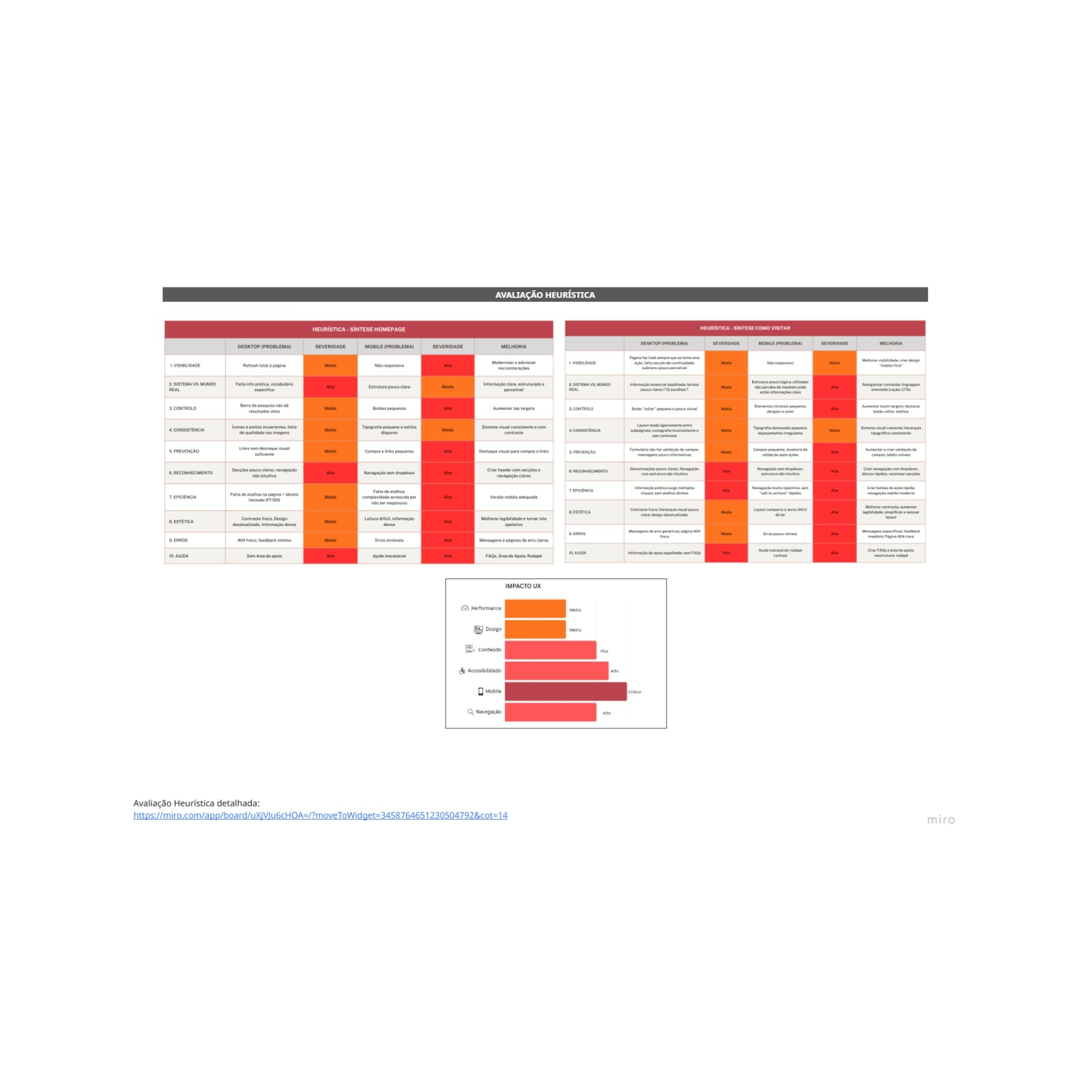
Through a detailed heuristic evaluation, several structural and experiential issues were identified:
Lack of Responsiveness
The website failed to adapt to mobile devices, creating friction for tourists and casual visitors who relied on smartphones to plan visits on the go.Accessibility Barriers
With an accessibility score of approximately 53%, the platform presented multiple issues, including insufficient contrast, missing alternative text, and a lack of clear navigation landmarks — limiting access for users with visual or cognitive impairments.Disconnected Ticket Flow
The absence of a direct online ticket purchase flow led to a fragmented journey, increasing friction, reducing convenience, and potentially contributing to lost revenue.Disorganized Content Structure
Educational and research materials — one of the museum’s strongest assets — were buried under dense text blocks and unclear hierarchies, making discovery difficult for teachers and students.
Together, these issues revealed a deeper problem:
the website was structured around institutional logic rather than user needs, prioritising completeness over clarity and access.
User Insights
To better align the redesign with real user needs, three core personas were developed.
Rather than representing rigid user types, these personas helped structure priorities and decision-making throughout the project.
Elsa (The Tourist)
Needs quick access to practical information — opening hours, location, prices — and a seamless mobile ticket purchase experience that reduces planning friction.Ana (The Teacher)
Requires clear group booking processes and easily discoverable educational resources to support school visits and lesson planning.Miguel (The Student)
Looks for an intuitive way to explore the collection and access academic content without navigating dense or fragmented information structures.
These personas highlighted a shared need across audiences: clarity, efficiency, and guided access to information, regardless of intent or expertise.
The Solution
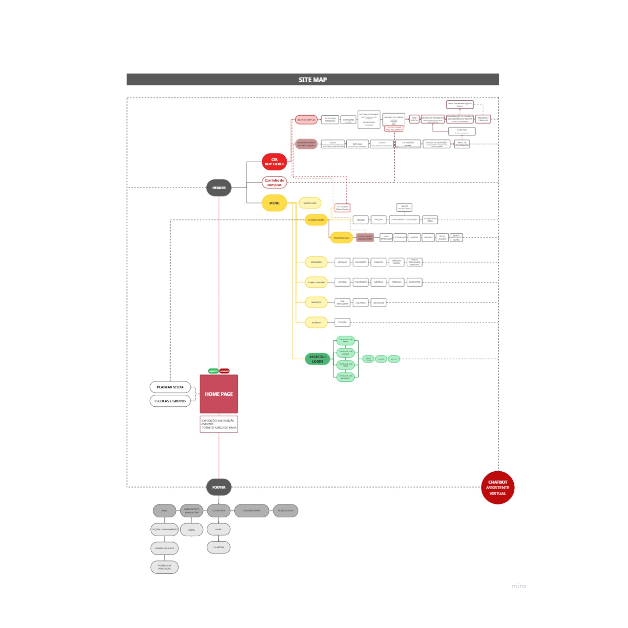
The proposed solution focused on simplifying access, improving inclusivity, and restructuring the experience around user priorities rather than institutional silos.
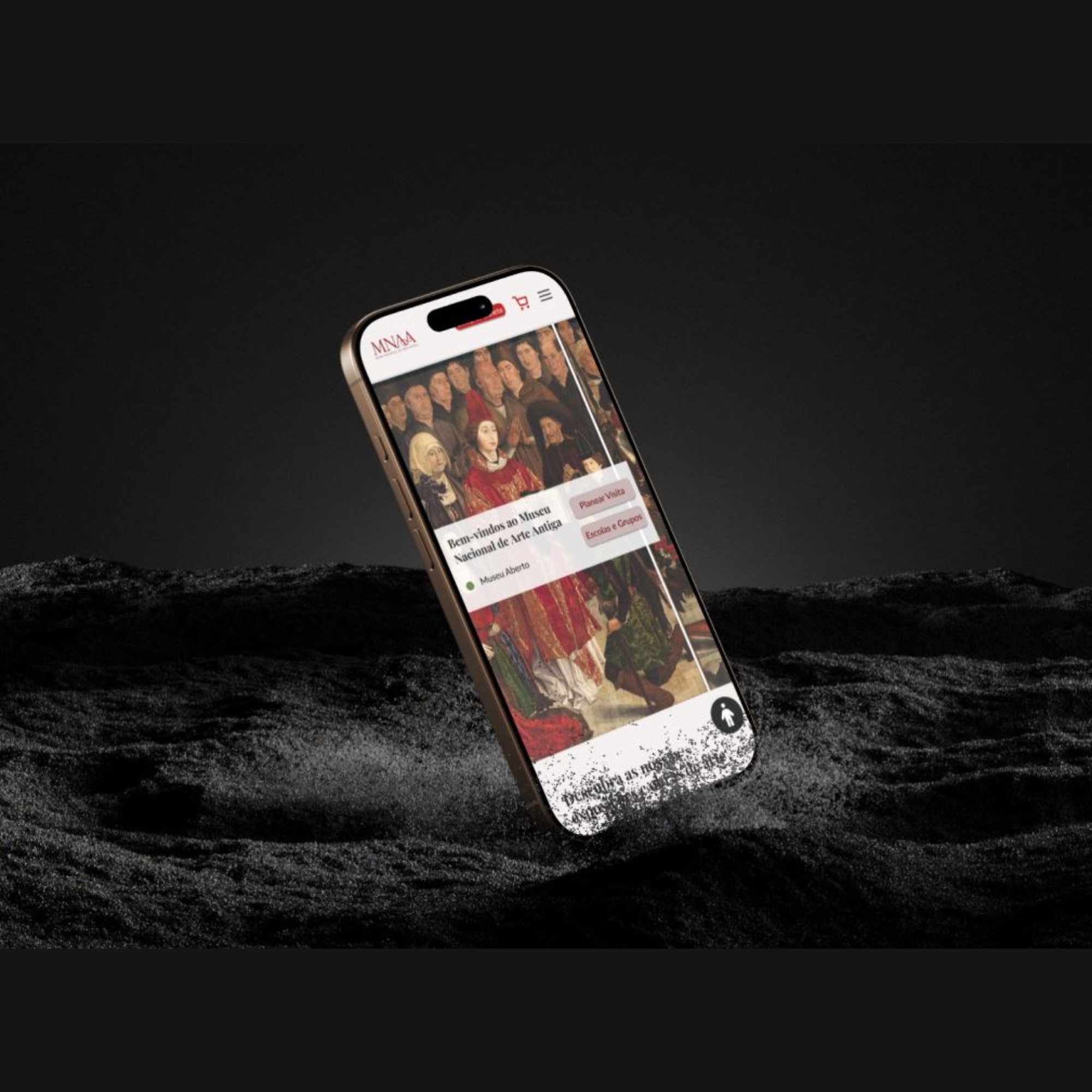
Mobile‑First Approach
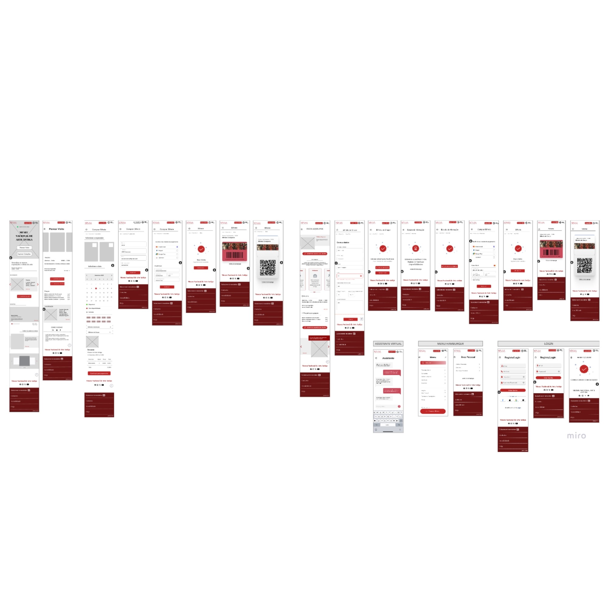
A complete layout overhaul ensured that all primary actions — ticket purchase, opening hours, navigation and content access — were optimized for mobile use.
Navigation was simplified through a clear menu structure and touch‑friendly interaction zones.Streamlined Ticket Checkout
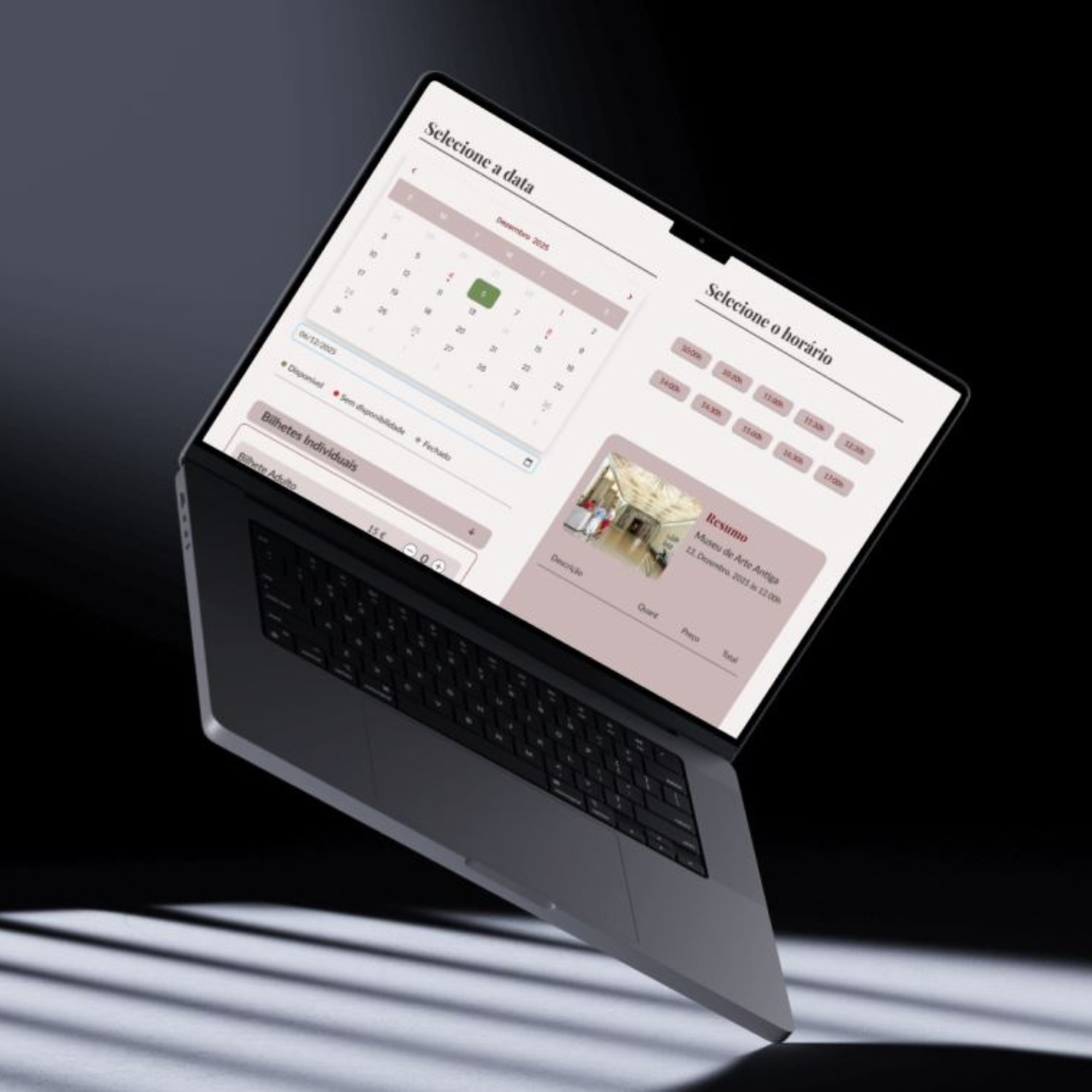
A linear four‑step purchase flow (Selection → Date → Payment → Confirmation) was introduced, reducing cognitive load and enabling the delivery of digital QR‑code tickets for immediate use.Improved Hierarchy & Accessibility
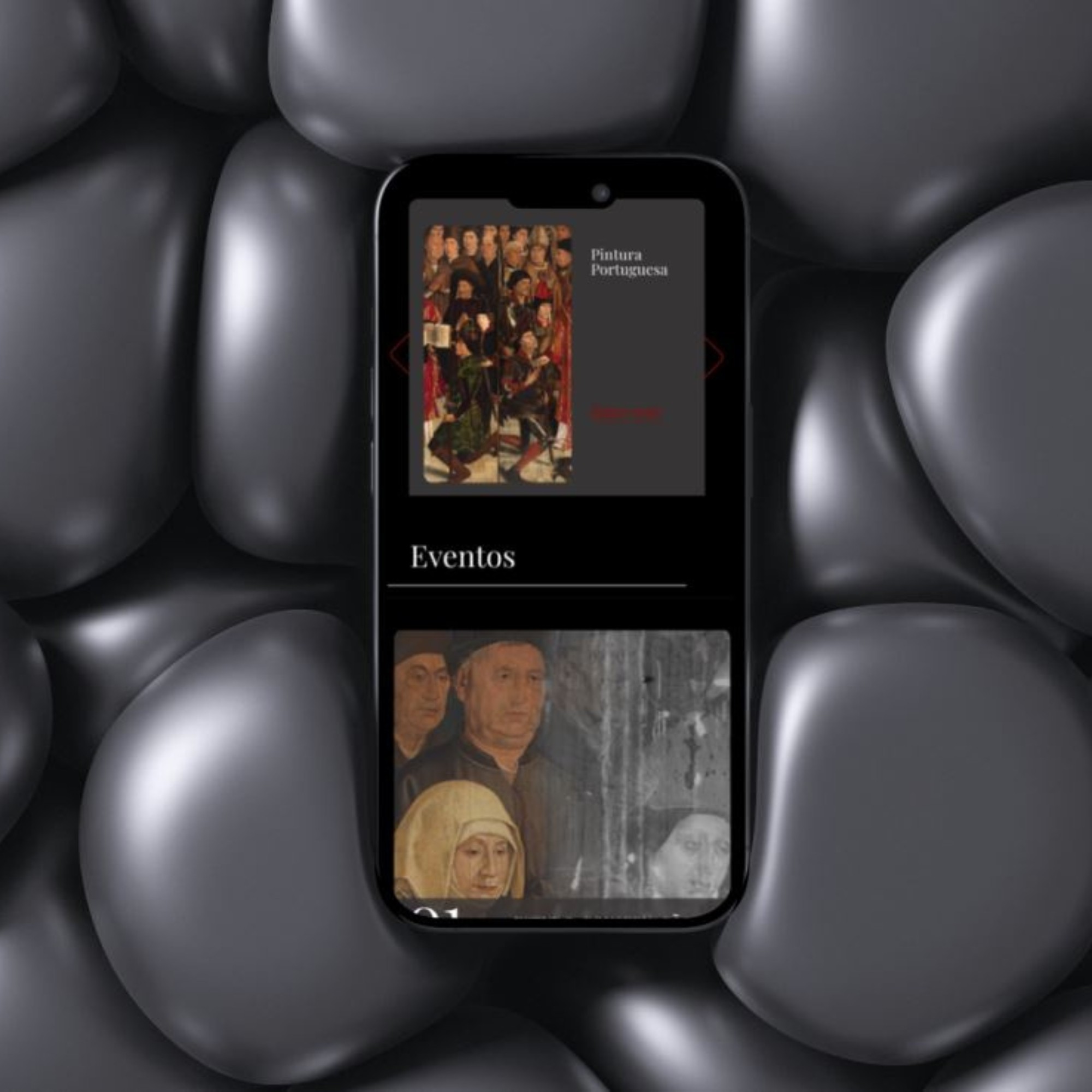
A new design system was implemented with WCAG‑compliant contrast ratios, consistent typography, and a clearer content hierarchy.
An “Education” hub was created to centralize and surface educational resources that were previously difficult to locate.
Each design decision aimed to reduce friction while maintaining respect for the institution’s cultural and educational role.
Visual Identity
The visual language balances institutional heritage with contemporary digital standards.
Typography
Playfair Display was selected for headings to convey elegance and historical weight, while Lato was used for body text to ensure readability and accessibility across devices.Color Palette
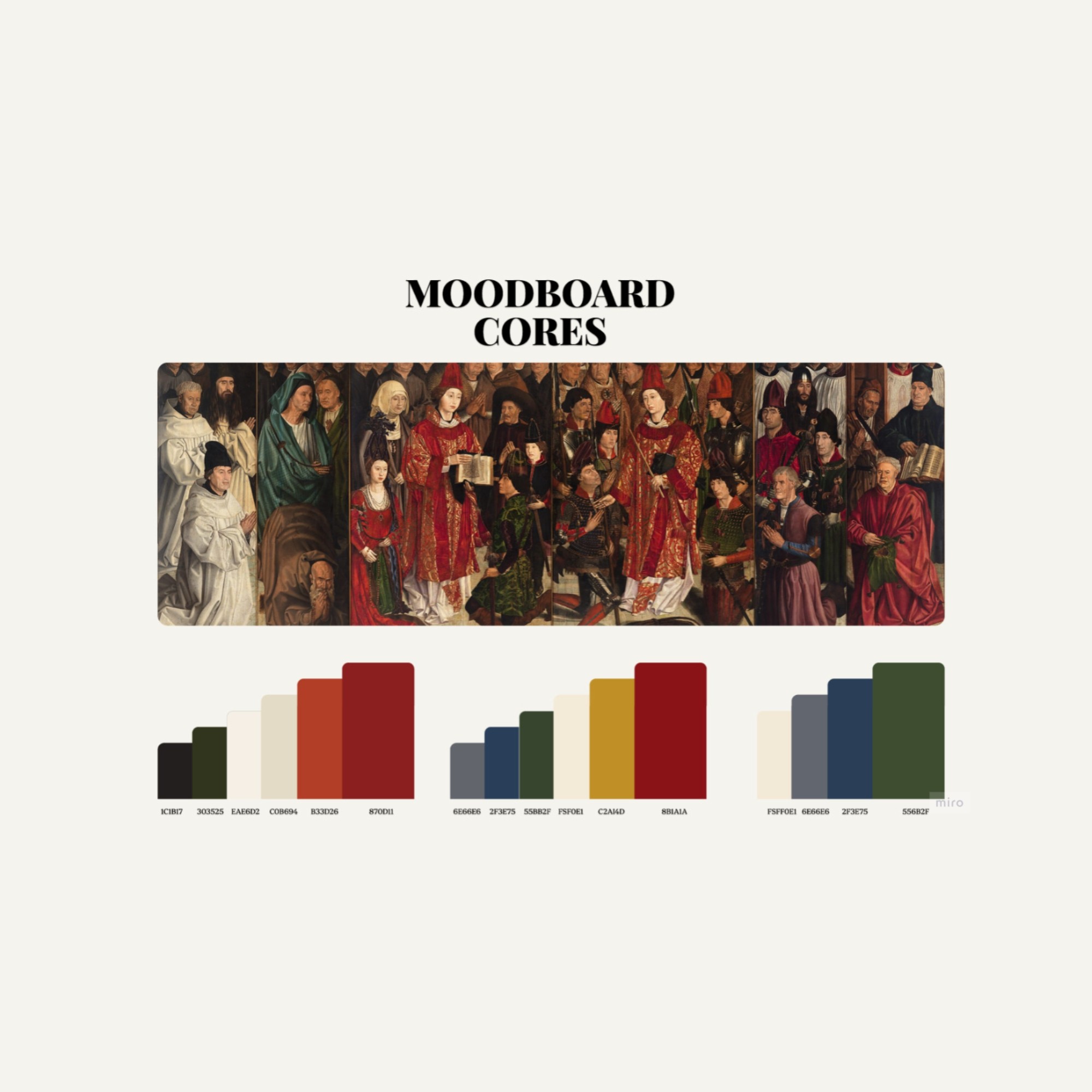
A restrained palette combining deep reds (#C02626) with neutral tones was introduced to echo the museum’s artistic legacy while maintaining clarity, contrast, and usability in a digital environment.
The visual system supports the content without overpowering it, ensuring that form enhances access rather than competing with it.
Industry
Digital Experience Redesign
Year
Client
Bur&Dru